IDEA
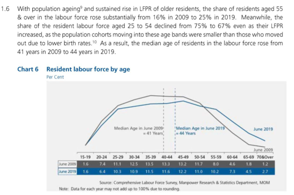
DataViz Makeover 3
This post aims to critique a published chart's data visualization and aesthetics, and in turn propose and design a new chart that can better visualize the findings from the report.
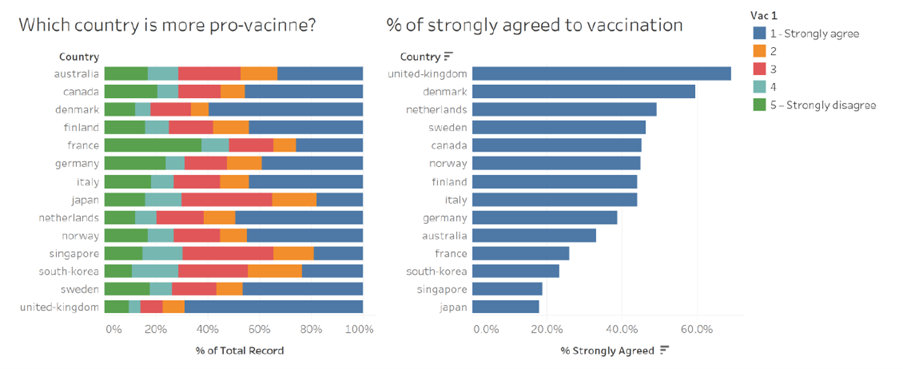
DataViz Makeover 2
This post aims to critique a published chart's data visualization and aesthetics, and in turn propose and design a new chart that can better visualize the findings from the report.
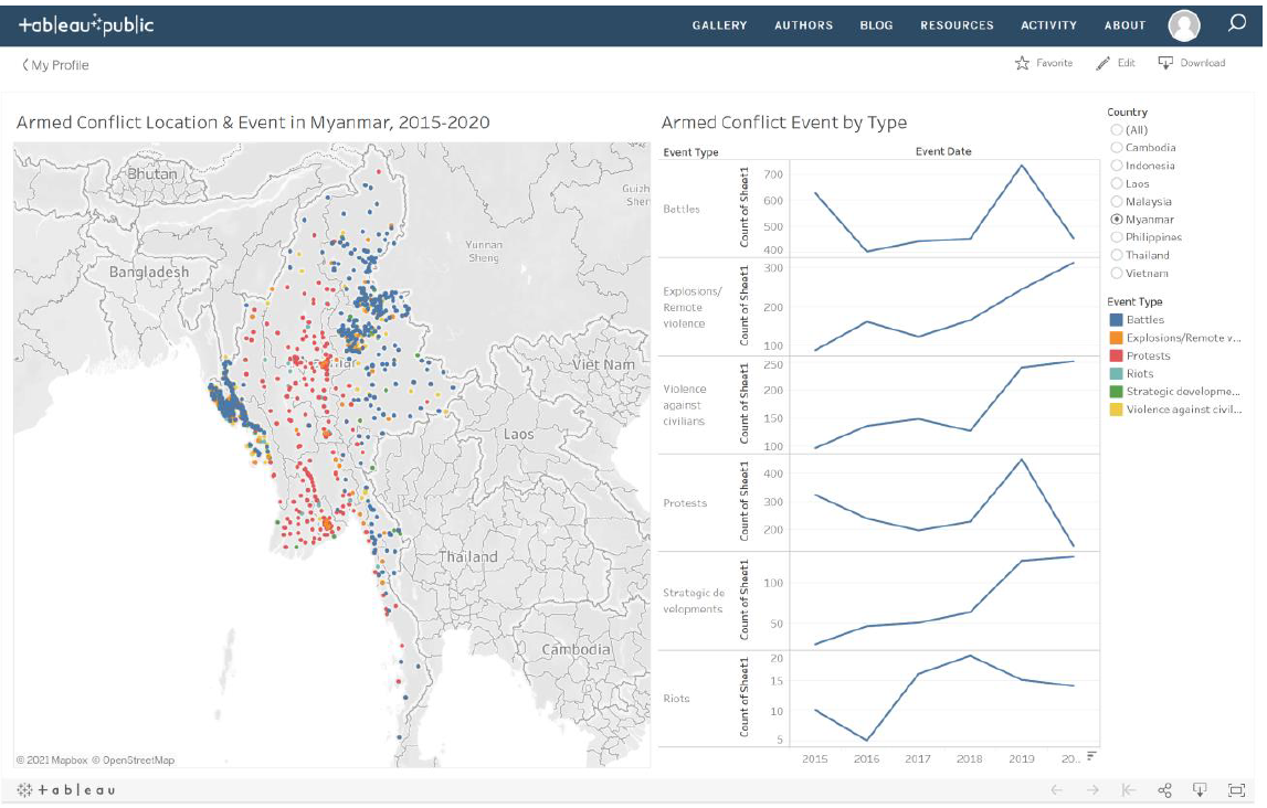
DataViz Makeover 1
This post aims to critique a published chart's data visualization and aesthetics, and in turn propose and design a new chart that can better visualize the findings from the report.
Welcome to IDEA
Welcome to our new blog, IDEA. We hope you enjoy reading what we have to say!
My First Post
A short description of the post.